Savr Recipes
User Research • Personas • Flowcharts • Sketches • User Interface • Prototyping
Project Overview
People feel that cooking a new recipe can be chaotic – instructions are wordy, unclear, and assuming of expertise. Whether it was not knowing if they were on the right track in the middle of the recipe, that they felt rushed during complicated steps, or that their time was being mismanaged.
The goal was to provide users with a clearer, thought-out process for recipes, eliminating confusion, the need to constantly scroll back and forth for ingredients and directions, and increasing efficiency.
My Contributions
Role: UX/UI Designer
Duration: 5-Day Design Sprint
Tools used: Figma, Miro
I was brought onto Savr to help come up with a solution to make cooks feel more confident in the kitchen. I was provided the transcripts from the user interviews and then created personas, user flows, sketches, a high-fidelity design and prototype.

PROBLEM
“Does this look right?”
The Savr team searched for participants to tell them about an experience cooking a recipe for the first time. They interviewed 10 people of different genders and ages. Whether the issues were with timing, running around the kitchen looking for unexpected utensils, or scrolling back-and-forth to double-check steps, at-home cooks found it can be sometimes stressful.
Meet Nick

“I can see what the finished product looks like, but I don’t know if I’m on the right track halfway through...is it supposed to look like this?”
-
• Unsure that he’s “on the right track” halfway through preparing the meal.
• Isn’t always clear on “what’s next.”
• Gets stressed out referring back to his phone every time a new step is introduced.ere -
• Follow recipe easily and confidently so dish comes out as expected.
• Wants trying new recipes to be enjoyable - not stressful and chaotic.
Nick’s Desired Experience

How Might We…
increase the efficiency of cooks?
help cooks feel confident during the process of cooking?
decrease the time spent going back and forth on the phone for clarification?
DISCOVERY
Before the sketch process, I searched for inspiration from leading competitor apps to analyze how they approached similar problems and get ideas of what would work well in Savr.
Competitor Analysis
Tasty
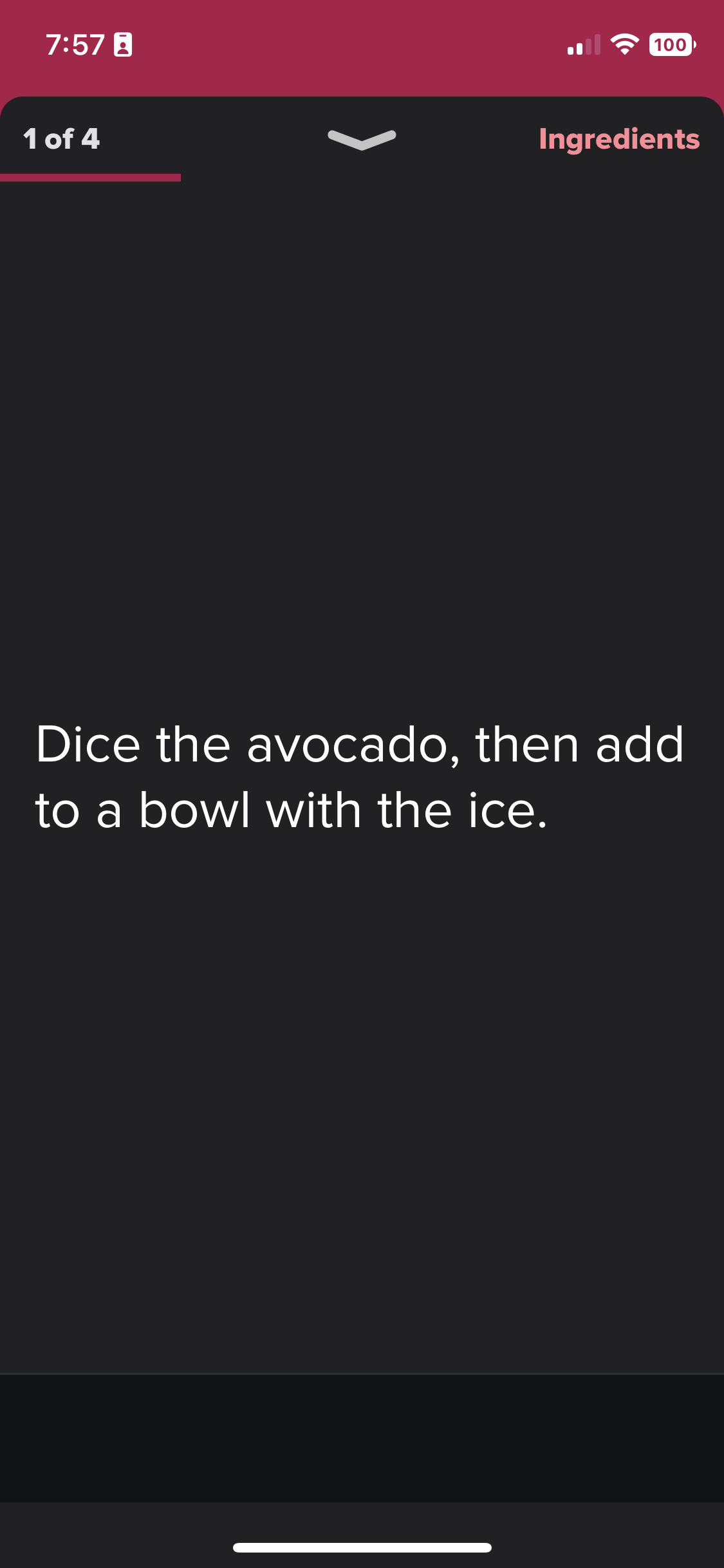
Tasty made a story-like step process. I definitely wanted to incorporate pieces of this. It makes it easier to see and walk through, minimizing scrolling and having to pick up the phone to read small text.
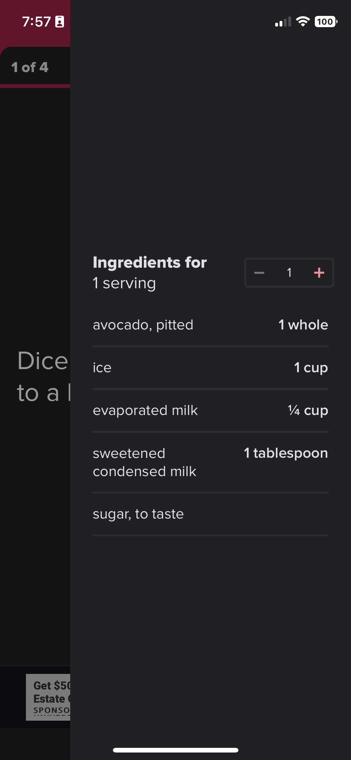
Having the ability to look back at what the ingredients are is extremely important in minimizing having to scroll back and forth to see exact measurements.
All Recipes
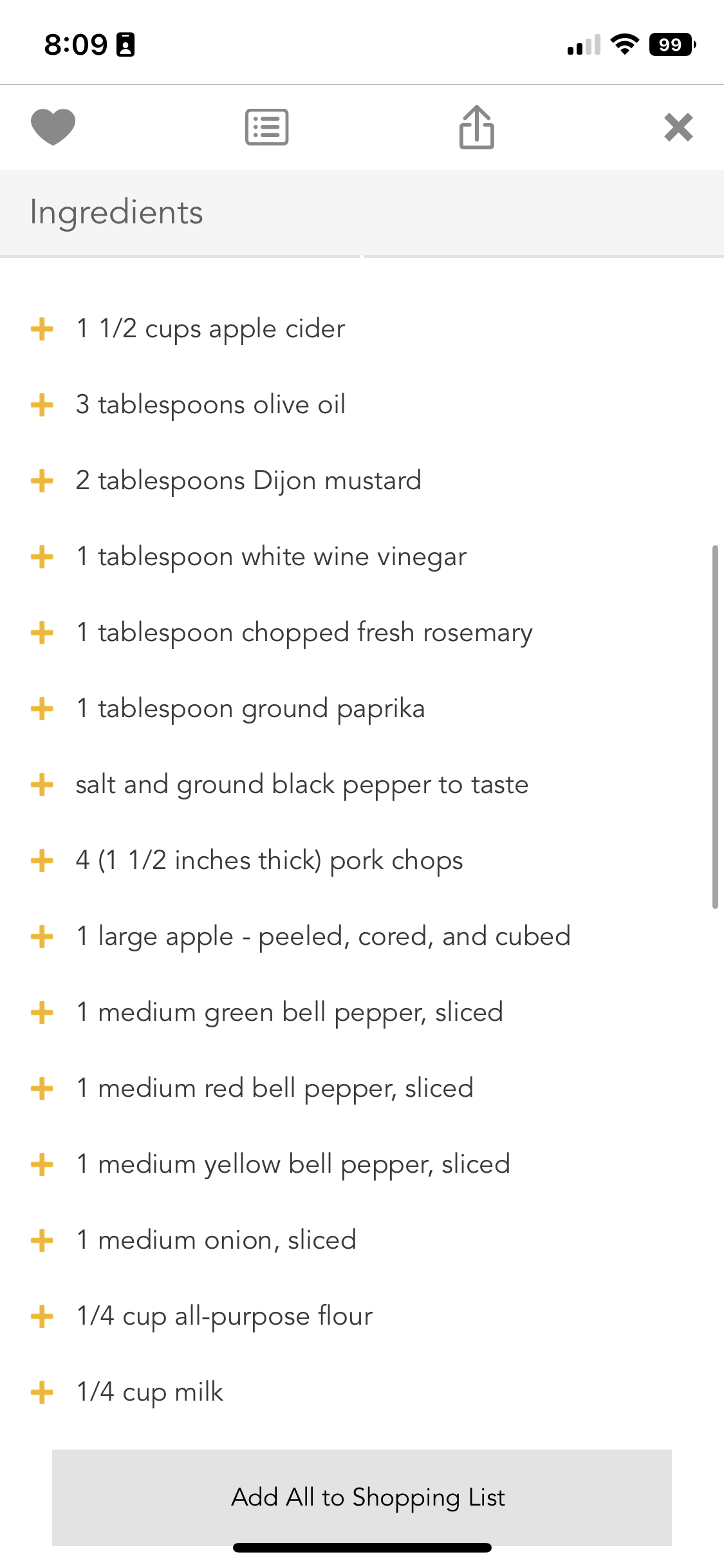
All Recipes had used a pretty basic, universal recipe design on their app. I would not say that anything about it was revolutionary, however, I did like that the user could add ingredients to a grocery list and also see an accurate time description for each part of the process. One of the main pain points found in research is the stress of timing.
There were still some things that were missing that would make Nick’s life a whole lot easier but I gained a better understanding of what is currently out there.

IDEATION
Cookin’ Up Ideas
Because this is a sprint, I did not want to waste too much time on wireframes so instead, I did a quick sketch.
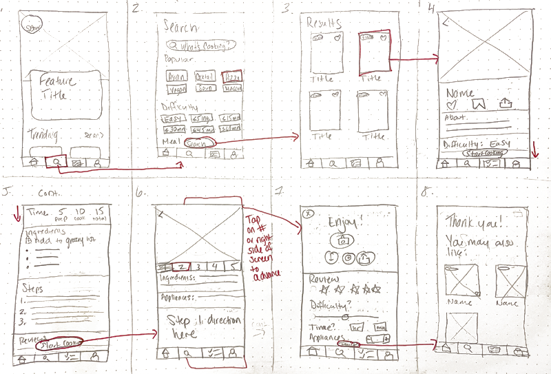
I created a Storyboard of how Nick would travel through the app, focusing on how Nick could use the app without having to click too much and also understand what the current step he’s on looked like.
I thought the review process should be detailed, as many mentioned in interviews that they felt they used too many dishes when they didn’t need to or it took longer than the expected time. Each person who completes the steps of the recipe should be prompted to answer these questions so the recipe can be more accurate.
DESIGN
Plating the Product
With the Storyboard top of mind, I worked in Figma to create some high-fidelity designs. I wanted to focus on aesthetically pleasing photos, simple navigation, and large text.
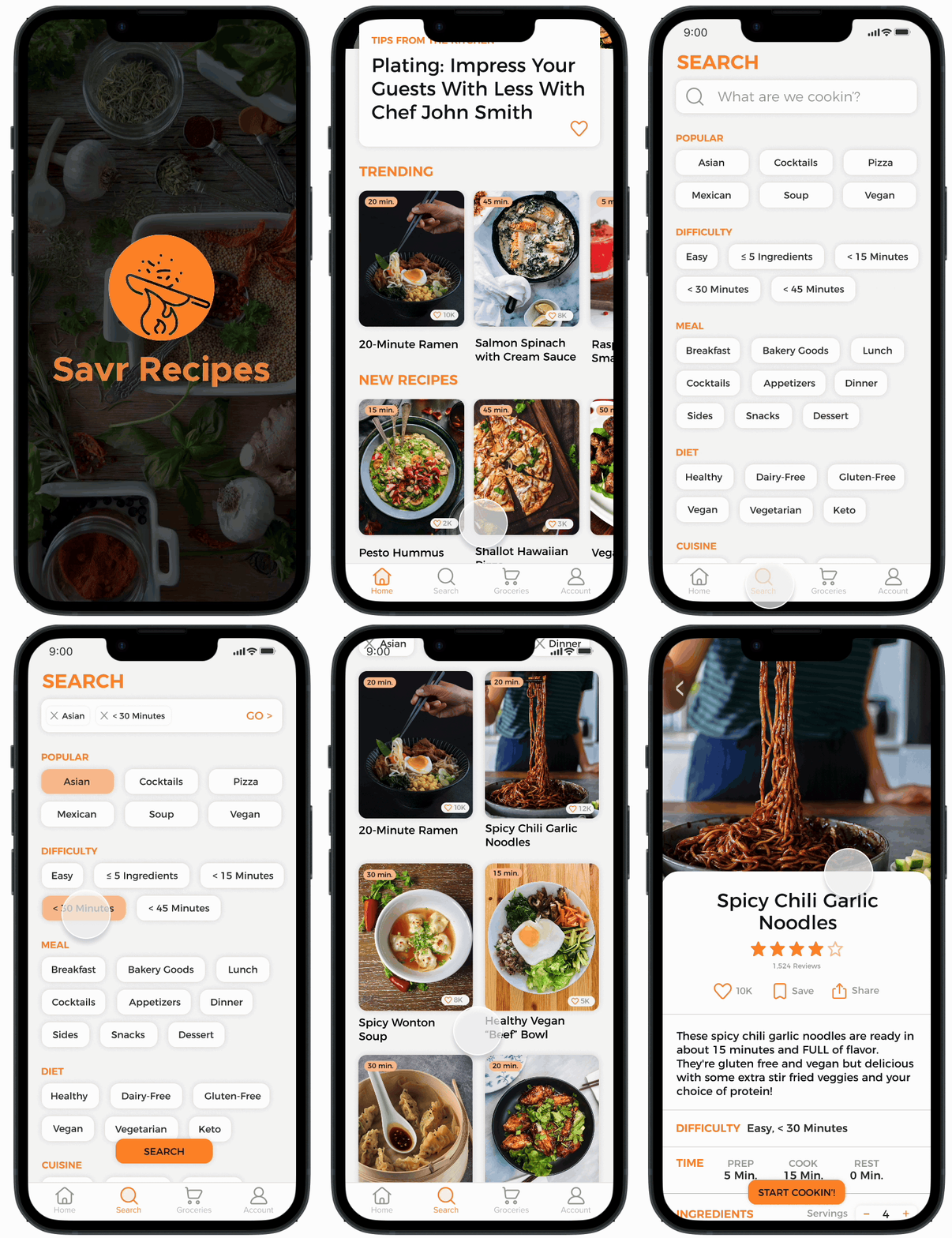
Searching for Recipes
The home screen features an article, as well as trending and popular recipes. I wanted the cooking time and how many people made it a “favorite” to be present.
The search page breaks out different categories that the user can filter through. Results are displayed in large, aesthetic tiles.
Easy, Clear Directions
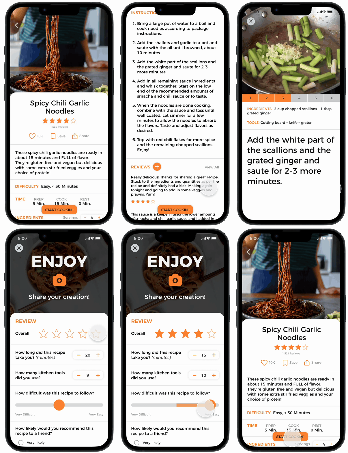
Once the user chooses a recipe, it will display how most recipes are provided - all the information on one long, scrollable screen. However, many interviewees said they struggled to refer back to their phone, especially with dirty/contaminated hands, having to scroll back and forth to see previous steps and ingredients. I created a Cook Mode to help eliminate the need to touch the phone as often.
The Cook Mode functions like an Instagram story, tapping on the left to go back or on the right to move forward. I created it with large, scannable text so users could see it clearly. Nick also mentioned that he sometimes does not know if he is on the right track halfway through so providing images of what each step looks like was important to add to the design.
Many users mentioned that they started a new recipe with the assumption that it would take the estimated amount of time but it ended up taking longer; they wasted time by washing a dish they were going to use again. Having them review the process once they’re done cooking would keep the recipe details accurate.
Grocery List
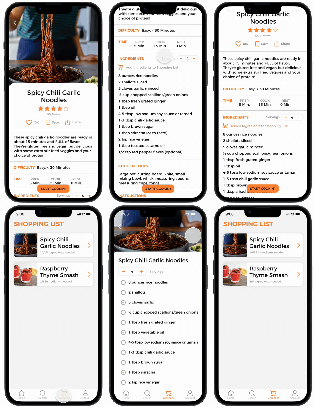
This was not part of the user’s goals, however, I thought it would be a nice feature to be added and wanted to build out the navigation a bit more.
One click will add the whole recipe to your grocery list, where you can then adjust how many servings and check off what you have.
PROTOTYPE
VALIDATE
Confident Cooks: ✓
After mocking up all of the high-fidelity screens, I created the prototype using Figma, adding interactions and transitions. As mentioned, creating interactions that helped cooks touch their phones minimally was extremely important.
Testing
Once the prototype was completed, I searched for feedback on my design by contacting people from my usability survey.
Participants:
5 people between the ages of 28-34
People who cooked a few times a week and tried new recipes often
The testing was done remotely through Zoom while the user shared their screen. I walked the participants through a series of tasks - find an Asian recipe that takes under 30 minutes, start the cook mode and leave a review. They had the ability to click and move around on the recipe page, as I wanted to hear their feedback if this would normally suffice for them if they used the shopping list function, and if the Cook Mode was something they would click on their own.
Results
Overall, the users really enjoyed the prototype. I received good feedback.
There were a lot of positive comments on the Cook Mode process. Users enjoyed the large font, accessible ingredients, process photos, and the familiarity of being able to tap through like an Instagram story.
The negative comment that seemed to be consistent across the board was that the kitchen utensils section didn’t feel too necessary. The section is not a bad thing to have if you’re a “newbie cook” and need more validation of the kind of things you’ll need, but as people who cook regularly, they don’t see themselves using that too often.
This was my first design sprint and I learned a lot about my process. Once I started designing, I had a hard time grasping that I did not need to fully build out an entire app. It is tempting to keep going when you are on a roll and love creating something new! However, being that it was a short 5-day sprint, time is extremely valuable and it is important to remember not to get too bogged down in the details right off the bat - especially before even testing it.
I would make a few iterations in regard to color, contrast, and spacing for next round.

